Visualization
For better presentation, it may be desirable to enhance the display of model outputs to highlight specific characteristics of the results. For example, the particle paths generated by the particle tracking functionality can be color-coded so that red signifies a faster flow velocity and green a slower flow velocity. This color change can be done by changing the layer symbology, as shown in Figure 5‑86. The result should resemble Figure 5‑87. Each path segment has been color-coded to the values in the SegVel attribute of the flow paths attribute table.
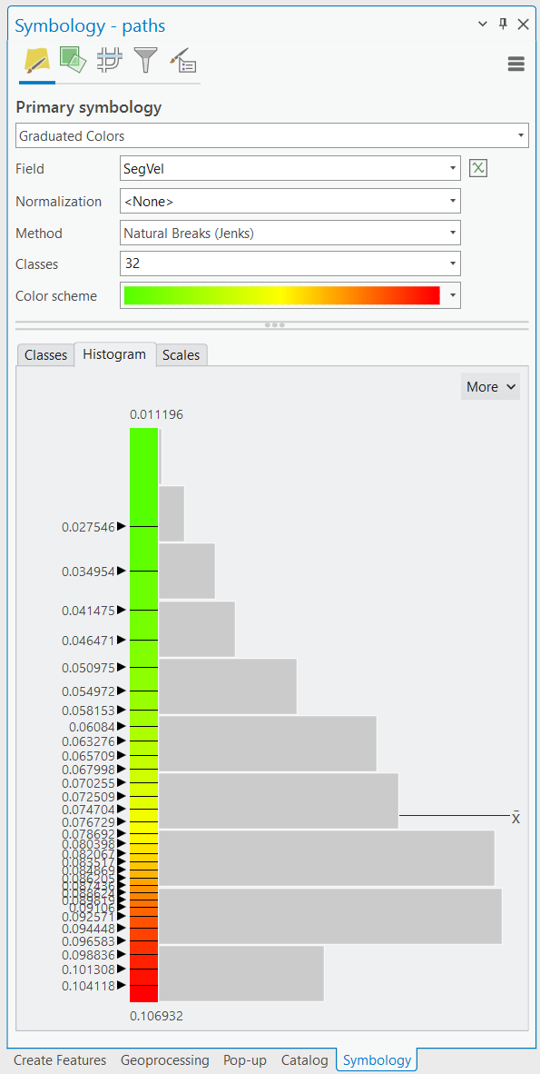
Figure 5‑86: Visualizing flow path velocities settings.
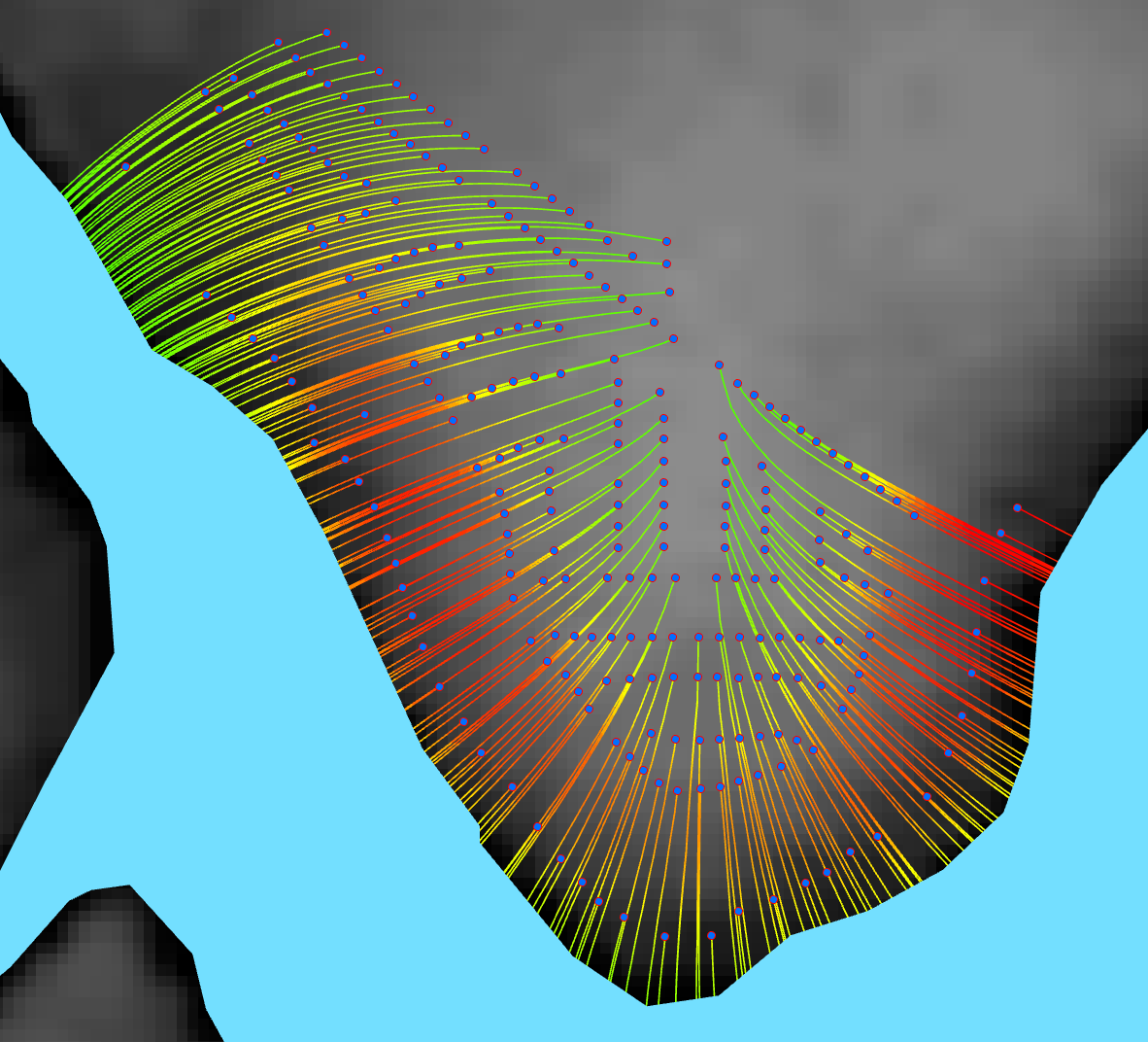
Figure 5‑87: Map visualizing flow path velocities.
Higher velocities are in red, and lower velocities are in green.
The display of the plume raster can be improved by selecting an appropriate color ramp. By selecting the raster symbology to the settings shown in Figure 5‑88, the result in Figure 5‑89 can be obtained. It is recommended to create custom contours using the SA tool Contour List to determine the locations of specific ranges of nitrate concentrations (e.g., the EPA level for nitrate concentration in drinking water, 0.1 mg/l). The result of contouring the plumes is shown in Figure 5‑90.
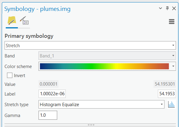
Figure 5‑88: Visualizing plume settings.
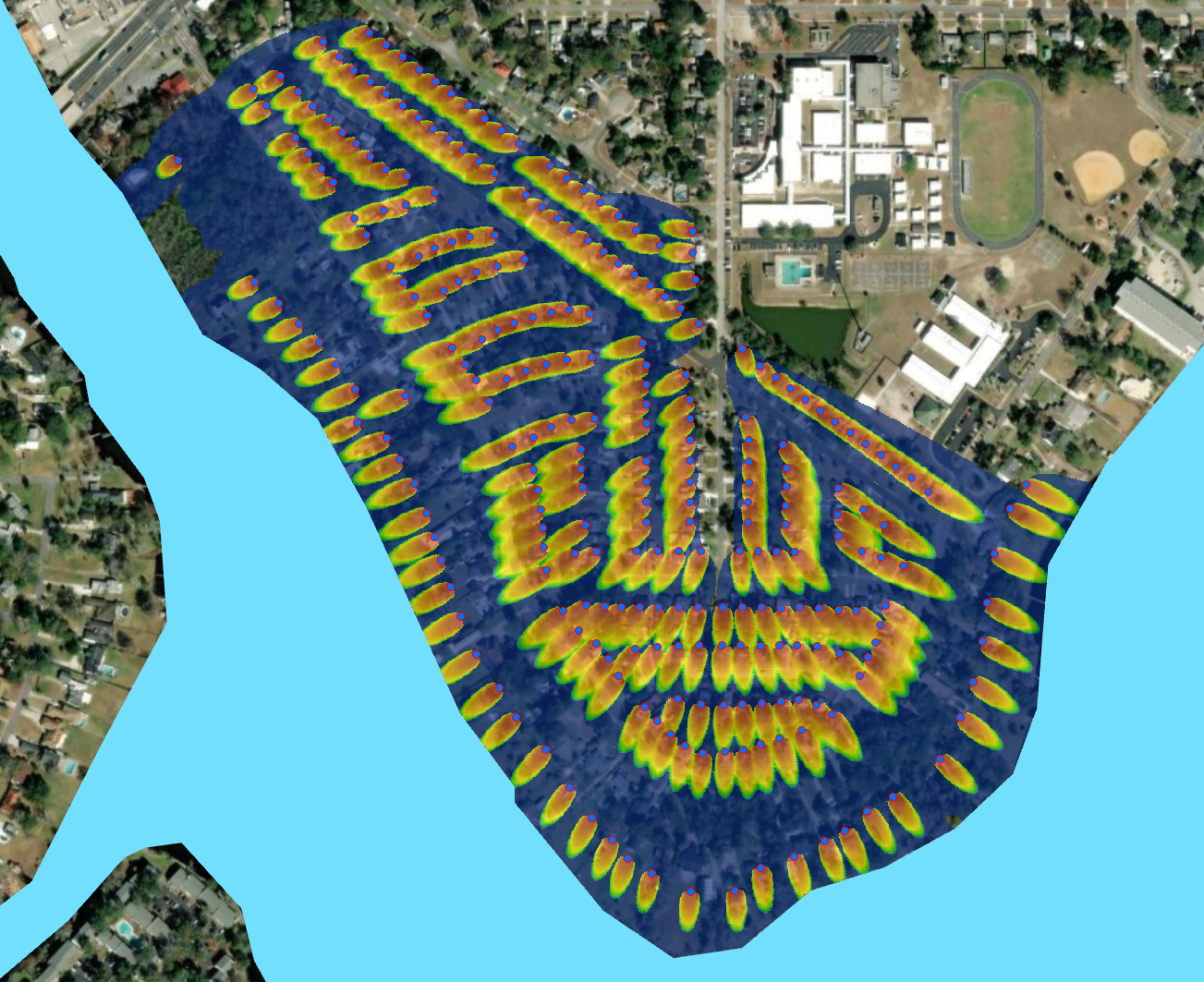
Figure 5‑89: Map visualizing plume concentration distributions.
The plumes have the highest magnitude of nitrate in red, fading to dark blue for cells with nitrate concentrations near zero. The water body is shown in blue.
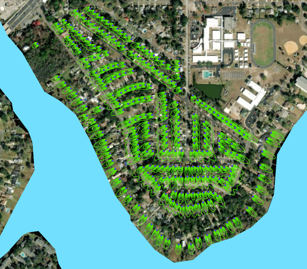
Figure 5‑90: Map visualizing plumes via custom contours.
The contours are shown in green and are classified via the nitrate concentration range.